Everything you can do, in one place.
The complete user manual. 13 content types, 5 tools, every workflow we built Ludessy to support. Use the search in the sidebar to jump straight to anything, or browse by section.
5-minute tour #
Everything you need to know to get going. Spend five minutes here and the rest of the docs becomes optional reference.
What Ludessy is
A workspace for game design where the things in your project are not just notes in a folder. They are typed records that know how to talk to each other. A character knows it is a character. A quest knows which character is its giver. An environment knows which level maps it. The result is a project that holds together as it grows.
The four things you'll touch first
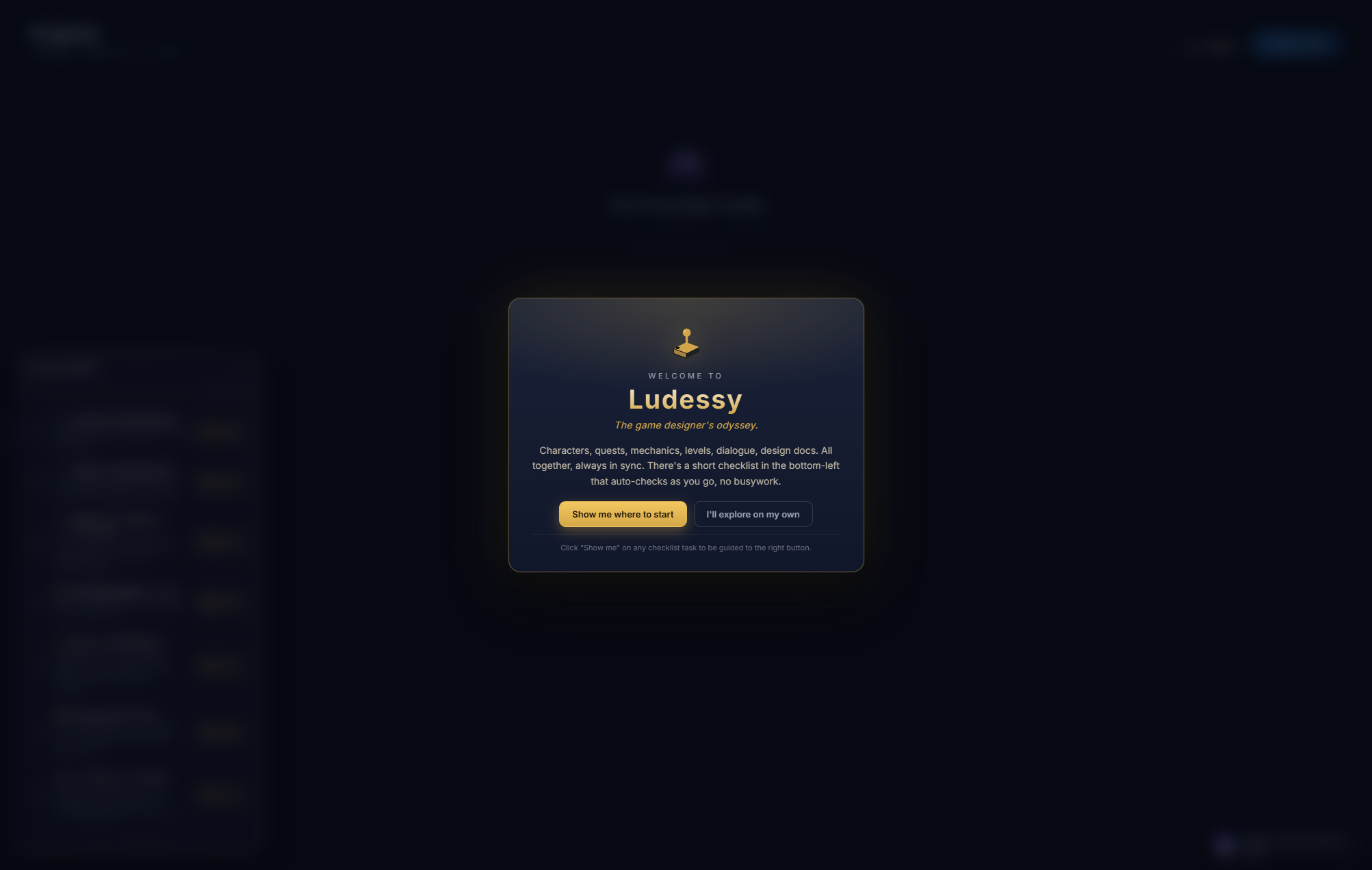
- Sign in. Google, Facebook, or email. The first time you sign in, a welcome modal greets you and a guided tour starts.
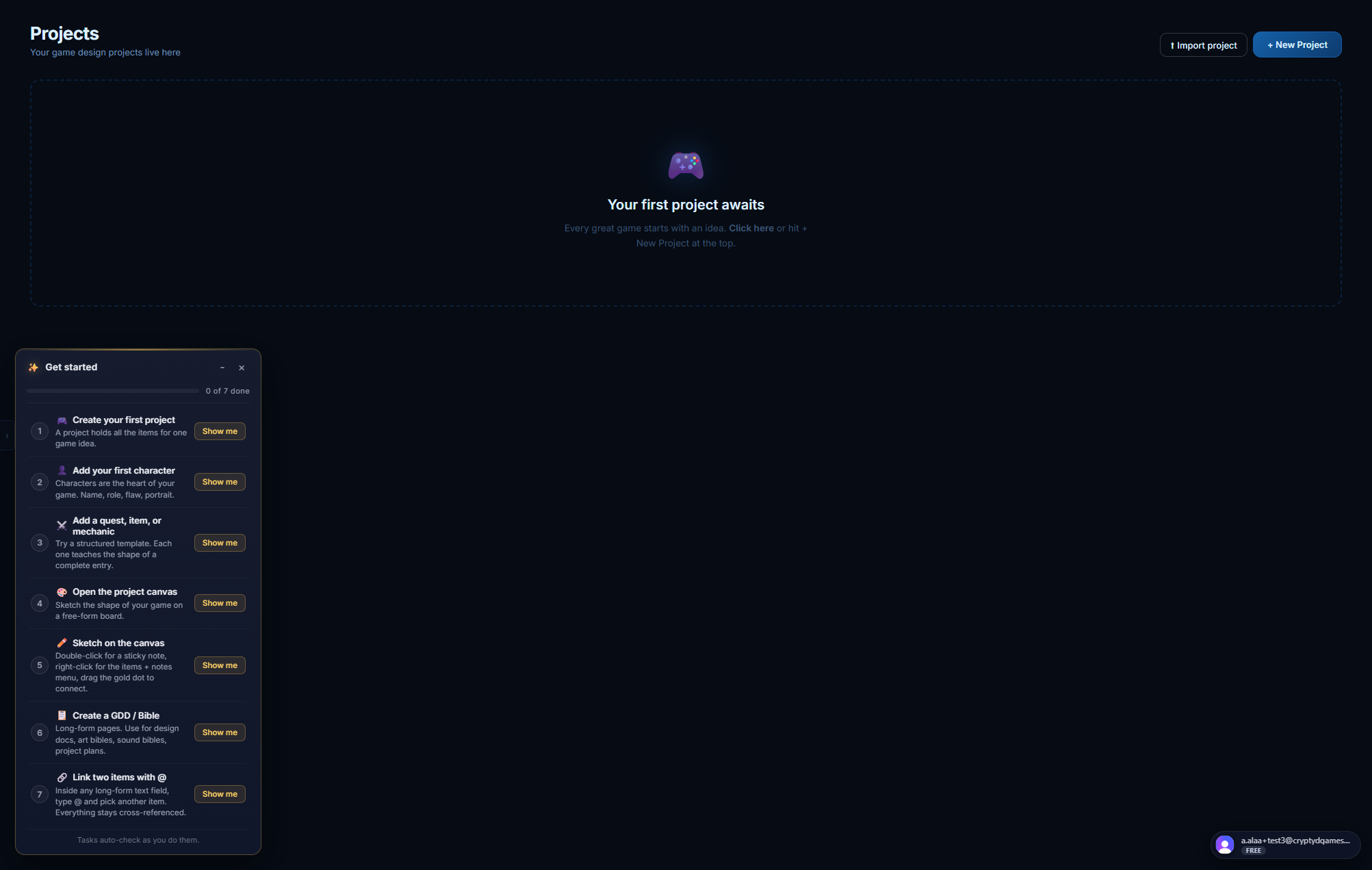
- Create a project. A project is a top-level container. One game, one project. Click + New Project in the top bar.
- Add content. Click + Add Content inside a project. Pick a type (Character, Quest, Environment, etc.). Fill in the structured fields. Save.
- Link things together. Inside any long-form text field, type @ to insert a chip that references another item. The chip stays clickable forever.
The sample project
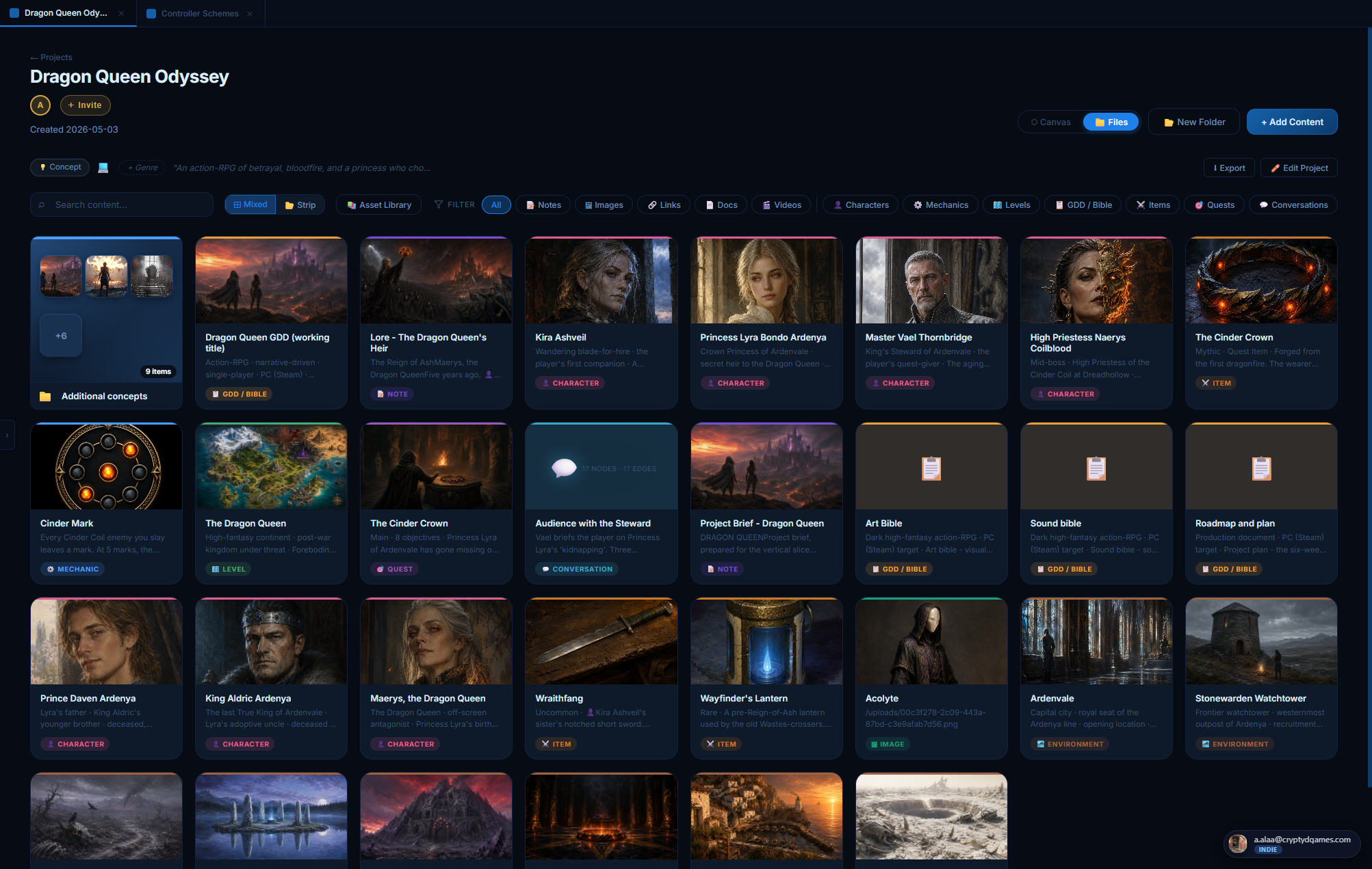
After you create your first project, Ludessy clones a fully-populated sample project into your workspace called Dragon Queen Odyssey. It contains characters, environments, items, a quest, a mechanic, a level map, design bibles, a project canvas, and a fully-wired set of cross-references. Open it and click around to see what a finished project looks like.
The sample is yours. You can rename it, edit it, delete it, anything. It will not auto-update from our side.
Core concepts #
Four ideas explain almost everything about how Ludessy works. Learn these and the UI becomes self-explanatory.
1. Projects
A project is the top-level container. One game = one project. Projects have a name, a thumbnail, a state (concept, alpha, beta, released, shelved), platforms, a genre, a description, and they hold everything else.
Free accounts can keep 1 active project; every paid plan (Indie, Team, Studio) is unlimited. Team and Studio projects can be shared with collaborators. (Open beta: everything is free right now, so the project cap is effectively off as soon as you switch from Free to Indie in one click.)
2. Items
Inside a project, every piece of content is an item. The item has a type (Character, Quest, Note, Image, etc.) that controls how it is edited and rendered. Each type has its own structured editor: a Character has a portrait + stats + visual notes; a Quest has objectives + steps + rewards; a Level has a map + pins + layers.
3. Folders
Items can be grouped into folders. Folders are color-coded, draggable, and Drive-style: open one to scope the project view to its contents. A folder is just a label; items can be moved in and out freely.
4. References
Items reference other items in two ways:
- @-mentions inside any long-form text field. Type @ and pick an item. A clickable chip is inserted; click it later to jump to the referenced item.
- Reference panels on structured sheets. Mechanics have a "Connected To" panel, Quests have giver/location/rewards/conversations slots, Environments have inhabitants/level/neighbor panels, Quests can pin to a level map, etc.
When you delete an item, its references on other items become broken-ref chips (red ⚠) so you can clean them up.
What types exist
Each type gets its own deep dive section below. Browse to whichever you want to learn about.
Items reference each other through two channels: structured references (named slots on a sheet, like a Quest's giver or an Environment's linked level) and free-form @-mentions you can drop in any rich-text field.
👤 Character #
Anyone alive in your game: protagonists, antagonists, NPCs, named enemies, questgivers, the king who died before the story started. Characters are the most cross-referenced thing in your project. Most other items end up pointing back at characters.
Where you find it
+ Add Content → Game Templates → 👤 Character. Same place from inside a folder; the character lands in that folder.
The character sheet, top to bottom
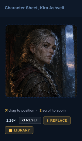
Portrait + cropper
Big square portrait on the left of the sheet. Upload by clicking the placeholder or use 📁 From library to pick an asset you've already uploaded. Once the portrait is set, you get a cropper UI directly on the portrait itself.
- Drag the portrait to pan around. Same gesture as Instagram's profile-photo cropper.
- Scroll-wheel over the portrait to zoom in / out (1.0× to 3.0×).
- ↺ Reset snaps back to defaults (centred X, head-third Y, no zoom).
- ⬆ Replace opens the file picker to swap the image.
- 📁 Library picks from your existing asset library.
Your crop is saved with the character and applied everywhere the portrait shows up: the project hub card thumbnail, the canvas node preview, the level-pin frame, the hover preview, the @-mention chip. Frame the face once on the sheet and it stays framed everywhere.
Identity (name / role / concept)
Under the portrait. Name is the item title, big and editable. Role / Class is a short subtitle (one line, plain text). One-line concept is a single sentence describing the character. Concept supports @-mentions, so you can say "the daughter of @Maerys" and the chip is clickable.
Stats grid
Four default stats (Health, Speed, Strength, Special) that you can rename, remove, or add to. Stat labels are editable: hover the stat block and click the pencil ✏️. The stat list is saved per project in your browser's local storage, so once you've established (say) "Resolve / Combat / Stealth / Charm" for one character, the next character in the same project starts with those same defaults.
Stats are flexible strings, not numbers. You can put "9", "starts at 3 / max 10", "Dragonborn, latent fire-breath" or anything else.
Personality (Traits / Motivation / Fear & Flaw)
Three short paragraphs side-by-side, each a rich-text field that accepts @-mentions. Optional. The framing is borrowed from screenwriting: most memorable characters can be summarized as (a) what they DO, (b) what they WANT, and (c) what stops them.
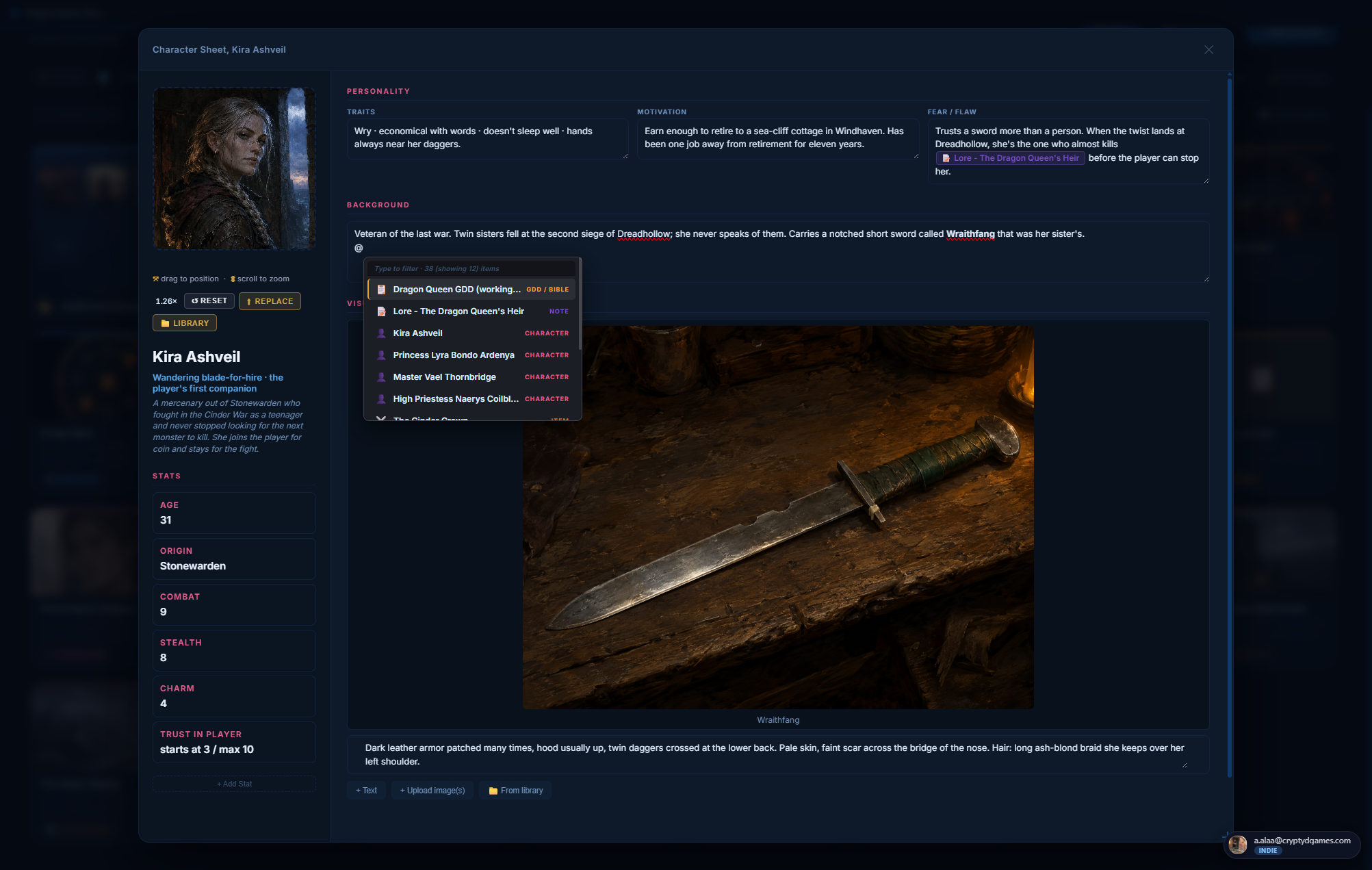
Background
Long-form rich text. The character's pre-story: where they're from, who they loved, what war they fought, the moment that broke them. @-mentions work here too, so you can drop in linked references to events, places, items, lore notes.
Visual Notes
At the bottom of the sheet. A drag-reorderable stack of text + image blocks for anything visual you want to capture: outfit notes, weapon details, alternative portraits, comparison shots. Click + Upload image(s) for one or many files. Multi-file upload becomes a single Gallery block (grid layout, click any tile to enlarge). Or click 📁 From library to pick an existing asset.
- Single-image blocks have a size bar (Fit / ¼ / ½ / ¾ / Full / Original) plus an editable caption.
- Gallery blocks autosize each tile. The whole gallery is one drag-reorderable block; tiles are also individually removable.
Where characters show up elsewhere
- Project hub cards: portrait with your custom crop, name, role, concept.
- Project canvas: node with portrait preview.
- Level editor: pin a character to the world map; the pin shows their portrait in a circular frame.
- Quest sheet: Quest giver slot accepts a character ref.
- Environment sheet: Inhabitants & connections panel.
- Conversation editor: each dialogue node points at a speaker (character ref).
- Mechanic sheet: Connected to panel.
- @-mention chip in any rich-text field.
Anatomy
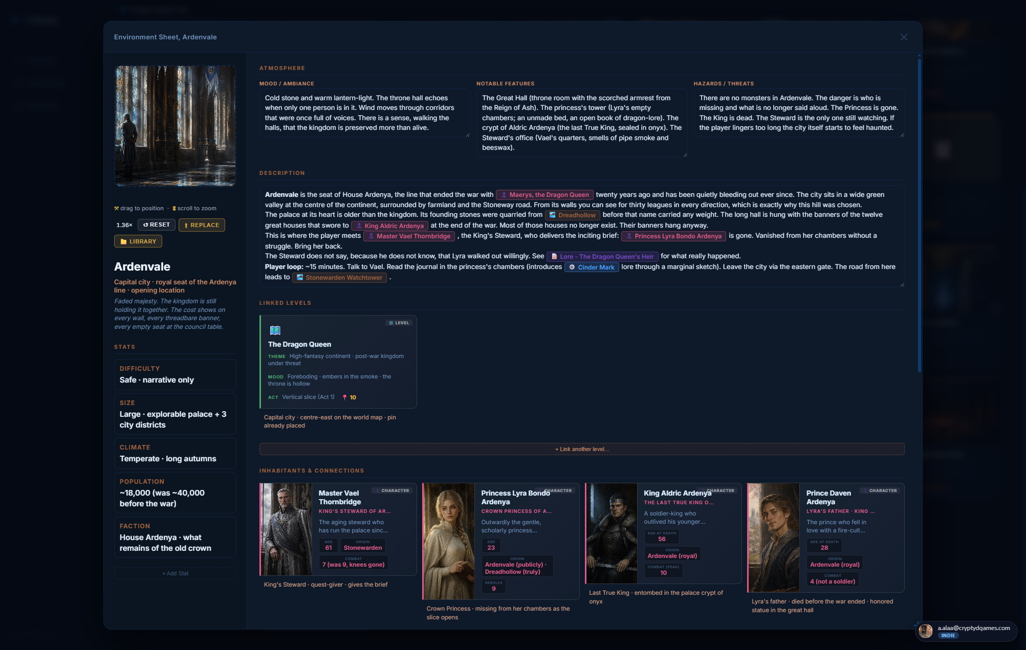
🏞️ Environment #
A place. A city, a dungeon, a forest, a watchtower, an abandoned port. Environments are conceptually distinct from Levels: an environment is the WORLD-FACT of a place (its lore, its mood, who lives there), while a level is the PLAYABLE MAP of that place (the actual scene with pins and polygons). One environment can be mapped by zero, one, or several levels.
Where you find it
+ Add Content → Game Templates → 🏞️ Environment. Note the sienna color: environments are deliberately tinted a warm earth-tone so they read distinct from characters (pink) and levels (green) everywhere in the app.
The environment sheet
Identical structural skeleton to the character sheet (same portrait + cropper + visual notes), with relabeled sections and an extra block of connection slots below the description.
Cover image (portrait)
Same big square as a character portrait but framed as a place. Use a landscape composition or a vertical key-art piece. Same cropper UI (drag to pan, scroll to zoom, ↺ Reset, ⬆ Replace, 📁 Library). The cover is what the env's hub card shows, what the level-pin shows when the pin links to this env, what the @-mention chip shows.
Identity
- Name: the place. ("Ardenvale", "The Whispering Marsh".)
- Type / Biome: short subtitle. ("Capital city", "Frontier watchtower", "Blighted plain".)
- One-line concept: the elevator pitch for the place.
Stats
Default stats for environments are different from characters: Difficulty, Size, Climate, Population. (Renameable per project; saved separately from character stats so the two never mix.)
Atmosphere (Mood / Notable Features / Hazards)
Three rich-text paragraphs. The framing is intentionally sensory: what does this place FEEL like, what are its standout landmarks, and what threatens the player here. @-mentions work in all three.
Description
Long-form lore. History, current state, who shaped it, what happened here. This is where the wiki-style world-bible content lives.
The connection panels (env-only)
Below the description, three sienna-tinted sections that wire the environment into the rest of your project. Each linked item renders as a full rich card (same renderer the GDD object-reference block uses) so the panel reads like a living index, not a list of chips.
Linked Levels (multi)
Pick one or more Level items that map this environment. Click + Link a level. The picker is filtered: only level items are selectable. An environment can have many levels (entrance scene, deep interior, hidden glade) and one level can be referenced by many environments.
Each linked level gets an inline note: "Which section of the env does this level map? (e.g. 'entrance', 'deep woods')". The note saves on the link itself.
Inhabitants & Connections (multi)
Anything in the project that has a relationship with this place. The picker accepts: characters, mechanics, levels, GDDs, items, quests, conversations, notes, images, links, documents, videos. Environments themselves are excluded (those go in the next section).
Each link has an inline note: "How are they connected to this place? (e.g. 'village elder, lives above the smithy')". Use these to capture the relationship, not just the existence.
Neighboring Environments (multi)
Other environments adjacent to this one. The picker is filtered to env items only. Lets you build a queryable geographic graph: "The Whispering Marsh borders the Black Pine Forest to the north."
Each neighbor link's note describes the relationship: "Where is this neighbor in relation? (e.g. 'to the north, across the river')".
Visual References
Same block as Character's Visual Notes, repurposed as a reference plate gallery for the environment's art direction.
How environments interact with the map
On a Level, dropping a pin and linking it to an environment makes the pin render as a landscape rectangle with the env's cover image, sienna-bordered. Click the pin to open the env's sheet directly. This is how the Dragon Queen Odyssey sample's world map works: every city / watchtower / waste is one rectangle pin pointing at one environment item.
⚔️ Item #
Weapons, armor, consumables, key items, currency, anything the player can pick up, equip, or trade. Items have a structured sheet built around an icon, a rarity tier, stats, and lore.
Where you find it
+ Add Content → Game Templates → ⚔️ Item.
The item sheet
Hero icon (top of the sheet)
Pick from the built-in SVG icon set (~30 weapon / armor / consumable / key-item glyphs) OR upload your own image. The icon area supports the same drag-pan + scroll-zoom cropper as the character portrait, so uploaded photos can be framed cleanly.
The icon's color follows the rarity tier: common (grey), uncommon (green), rare (blue), epic (purple), legendary (gold), mythic (pink). The rarity color is used as a glow around the icon on cards and pins.
Name + rarity + subtype
Short identity row. Rarity is a dropdown enum (the six tiers above). Subtype is a free-text string ("two-handed sword", "trinket", "key item", "currency") used as a sub-line on cards.
Tagline
One-line italic flavor text. Appears under the name on hover previews. Optional.
Description
Long-form rich text. What the item does in-fiction (not necessarily its game-mechanical effect; for mechanics use the Mechanic type).
Stats grid
Same pattern as character stats: label + value pairs you can add, rename, remove. Defaults: Damage / Effect, Speed, Range, Special Property. Free-text values so you can write "1d8 slashing" or "+5 to all attack rolls" or "burns until rest" without locking yourself to numbers.
How to obtain
Rich text. Where in your game the item drops, who has it, what quest unlocks it, the chain of events that leads the player to it.
Lore / Backstory
Rich text. The item's history before the player gets it. Optional but the place to capture details that don't fit "How to obtain".
Tags
Quick free-text chips for categorization ("loot", "endgame", "starter gear", "cursed"). Useful for filtering later.
Buy / Sell value
Two short text fields. Use them or leave them empty. Free-text so you can put "30 gp / 12 gp" or "unsellable".
Visual notes
Same drag-reorderable text + image stack as the character sheet, for reference plates, concept variants, comparison shots.
Where items show up elsewhere
- Project hub cards: rarity-colored tile with icon, name, rarity, tagline.
- Quest sheet: Reward items multi-ref accepts items.
- Level pin: a pin can link to an item; renders a small rarity-glow square.
- Environment sheet: Inhabitants & connections can include items found there.
- @-mention chip in any rich-text field.
- GDD object-ref block: items render as a horizontal text-left + icon-right card.
⚙️ Mechanic #
A core game system: combat, crafting, dialogue, magic, stamina, the Cinder Mark. Mechanics are different from items because they describe RULES, not OBJECTS. They have a structured sheet with category, core loop, balance notes, and explicit cross-references to whatever they touch.
Where you find it
+ Add Content → Game Templates → ⚙️ Mechanic.
The mechanic sheet
Icon + category
Same icon hero pattern as items (SVG library or upload, drag-pan + scroll-zoom cropper). Category is a dropdown that tints the icon: Core, Secondary, Meta, Combat, Economy, Social, Movement, etc.
Name + subtype + tagline
Top identity. Subtype is a free-text label ("real-time", "turn-based", "passive"). Tagline is the one-line elevator pitch.
Description
Long-form. What this mechanic actually is, in plain language. Anyone reading the project should be able to understand the mechanic from this field alone.
Core loop
The repeating player action. "Input -> signal -> reward -> input again." One paragraph. The single most important field on the sheet.
Input / Process / Output
Three side-by-side fields. Input: what the player does. Process: what the game does in response. Output: what the player gets (feedback, score, resource, story progression).
Feel-Goal Tags
Chip input. Type a tag, hit Enter. Use for the emotional design pillars: "tense", "satisfying click", "deliberate", "panicked", "tactical". Free-text but reusable across mechanics in the same project.
Connected To (multi-ref panel)
The mechanic's place in the project graph. Link characters who use it, items that trigger it, levels where it's prominent, quests that test it. The picker accepts any item type. Renders as a stack of rich cards (same as the environment sheet).
Balance notes / Edge cases / References
Three rich-text fields. Balance notes: tuning numbers, levers to pull, what to watch out for. Edge cases: what could break this (exploits, weird states, interaction bugs). References: other games / prototypes / videos you're drawing from.
Concept / Visual Notes
Same drag-reorderable image + text stack as character / environment. For HUD mockups, flowchart sketches, reference clips.
🎯 Quest #
A unit of player-driven story progression. Main quests, side quests, hidden quests, repeatables. Quests have a strong typed structure: a giver, a location, objectives, optional sub-objectives, ordered steps, rewards, and links to any conversations that drive them.
Where you find it
+ Add Content → Game Templates → 🎯 Quest.
The quest sheet
Icon + quest type
Built-in SVG icons (target, scroll, banner, dragon, treasure, etc.) or upload. Quest type dropdown is color-coded: Main (gold), Side (silver), Hidden (purple), Repeatable (teal).
Name + tagline + narrative hook
Identity row + a rich-text hook field. The hook is what the player hears from the quest giver to be drawn in: the inciting incident in one paragraph.
Quest giver (single character ref)
Pick one character. Slot opens the object-ref picker filtered to character items. Shows the character's portrait + role inline once linked.
Location (single level ref)
Pick the level where the quest plays out. Picker filtered to level items only. The linked level's pin shows the quest on the world map.
Objectives (ordered, with sub-objectives)
The required steps. Each objective has:
- A text line (what the player must do)
- A flag dropdown: Primary, Secondary, Optional
- An optional 📎 attached image (40x40 thumb on the objective, clickable to enlarge in the viewer)
- An expandable list of sub-objectives (sub-steps that compose the parent)
Steps (the route through the quest)
Ordered list of steps with a text description + a condition (what triggers the next step) + an optional branchTo (which step the player jumps to if they take a particular action). Use this for branching quest design.
Rewards
- XP (free-text, e.g. "1500 XP cap")
- Items (multi-ref to gameitem items, shown as a row of rarity cards)
- Story outcome (rich text: what changes in the world)
- Flags (free-text: state variables set on completion)
Failure conditions
Rich text. How the quest can fail or be missed.
Conversations (multi-ref)
Link conversation items that fire during this quest. Each link has an optional "atStepId" field that pins the conversation to a specific quest step.
Visual notes
Same image + text stack pattern.
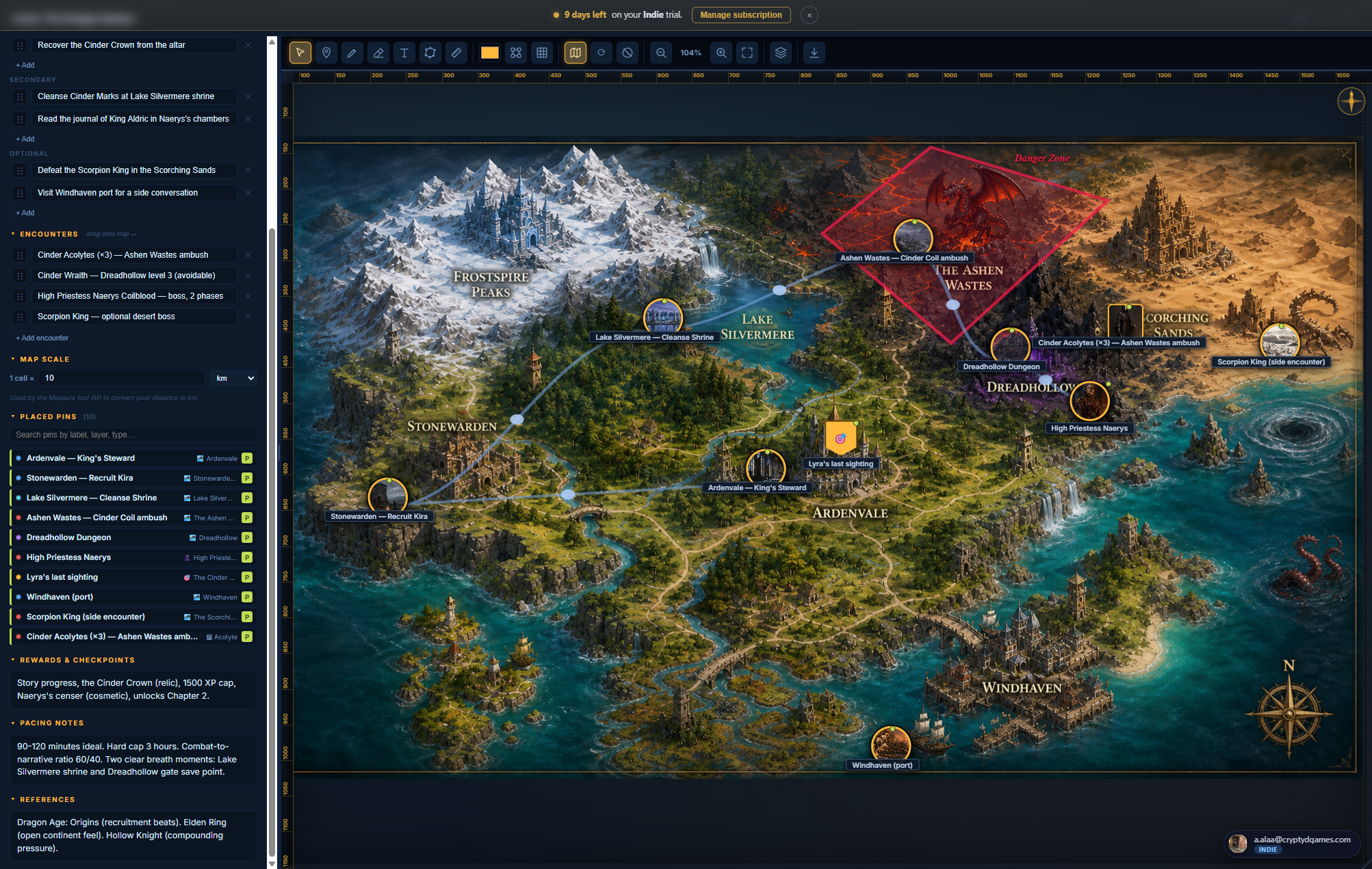
🗺️ Level #
A playable map. Upload your map image (a hand-drawn map, an exported tilemap, a Photoshop mockup, satellite shot of a real place, anything 2D), then drop pins, draw polygons, layer encounters. The level editor is the most visually rich tool in Ludessy and pairs naturally with Environment items for world-building.
Where you find it
+ Add Content → Game Templates → 🗺️ Level.
The level editor, top to bottom
Map background
Click 🗺 Map in the toolbar to upload your map image. The level renders it as a full-bleed background with the editor canvas on top. The background can be replaced any time. You can also use the parchment-style default (no background) and place pins on the empty parchment if you don't have a map yet.
Tools palette (left side)
- 👆 Select (V): pick / move / multi-select shapes
- 📍 Pin (W): click anywhere on the map to drop a pin
- 🔷 Polygon (P): click vertices to draw an area; press Enter to close
- 📐 Rectangle (R): drag to draw an axis-aligned region
- ⭕ Circle (C): drag from center outward for a radius
- ✏️ Text (T): click to drop an inline-editable text label
- 🔗 Connection: pick two pins to draw a line between them
Pins (and what they can do)
A pin is a point on the map with an icon, color, optional label, and (most powerfully) an OPTIONAL REFERENCE to another item in your project. When a pin is linked:
- Character ref → pin renders as a circular portrait frame
- Environment ref → pin renders as a landscape rectangle with the env cover
- Item (gameitem) ref → pin renders as a rarity-glow square tile with the item icon
- Quest ref → pin renders as a flag/banner shape
- Level ref (sub-level link) → pin renders as a small map-thumb square
- Image ref → pin renders as a small square showing the image (top-biased crop for portraits)
- No ref → pin renders as a classic drop-pin shape
Click any linked pin to open the referenced item's sheet directly. The pin also has a hover-preview card that shows the referenced item's mini-card without leaving the level.
Layers
Like Photoshop layers but for the map. Each layer has a name, a color, and a visibility toggle. Use them to separate "story pins" from "encounter pins" from "decoration", or "Act 1" from "Act 2". Pins / shapes belong to one layer; toggling a layer hides all its content at once. Color-codes the pin frames so you can eyeball which beat each pin belongs to.
Objectives / Encounters / Rewards (right-side panel)
Three structured lists for the level's design notes:
- Objectives with primary / secondary / optional flags
- Encounters with a free-text description per row
- Rewards / Pacing notes / References as long-form fields
Polygons, rectangles, circles
Draw zones for safe areas, danger zones, faction territories, fog-of-war. Each shape has a fill color + opacity, an outline, and an optional label. Polygons support drag-to-move-vertex and Ctrl+Z to pop the last placed vertex while drawing.
Inline text labels
Text tool drops a draggable label directly on the map. Click to inline-edit. Use for region names, road names, "Here be dragons" annotations.
Pan and zoom
Scroll-wheel zooms, middle-click drag pans (also: 3-finger trackpad tap = middle-click = pan). The ⛶ Fit button frames the whole map. There's a minimap in the corner if the map is bigger than the viewport.
The right-side Pin List
Sidebar list of every pin on the level, searchable by label / type / layer. Click a pin in the list to fly the canvas to it (and pulse the pin briefly).
Pin shapes at a glance
When you drop a pin and link it to an item, the pin's SHAPE changes to match the linked item's type. The whole map becomes self-describing without legends or color codes.
📋 GDD / Bible #
The flagship multi-page document type. Use it for game design documents, art bibles, sound bibles, project plans, world-building wikis, anything that needs more than a single page of structured content. Each GDD is multi-page, block-based, and every block knows its type.
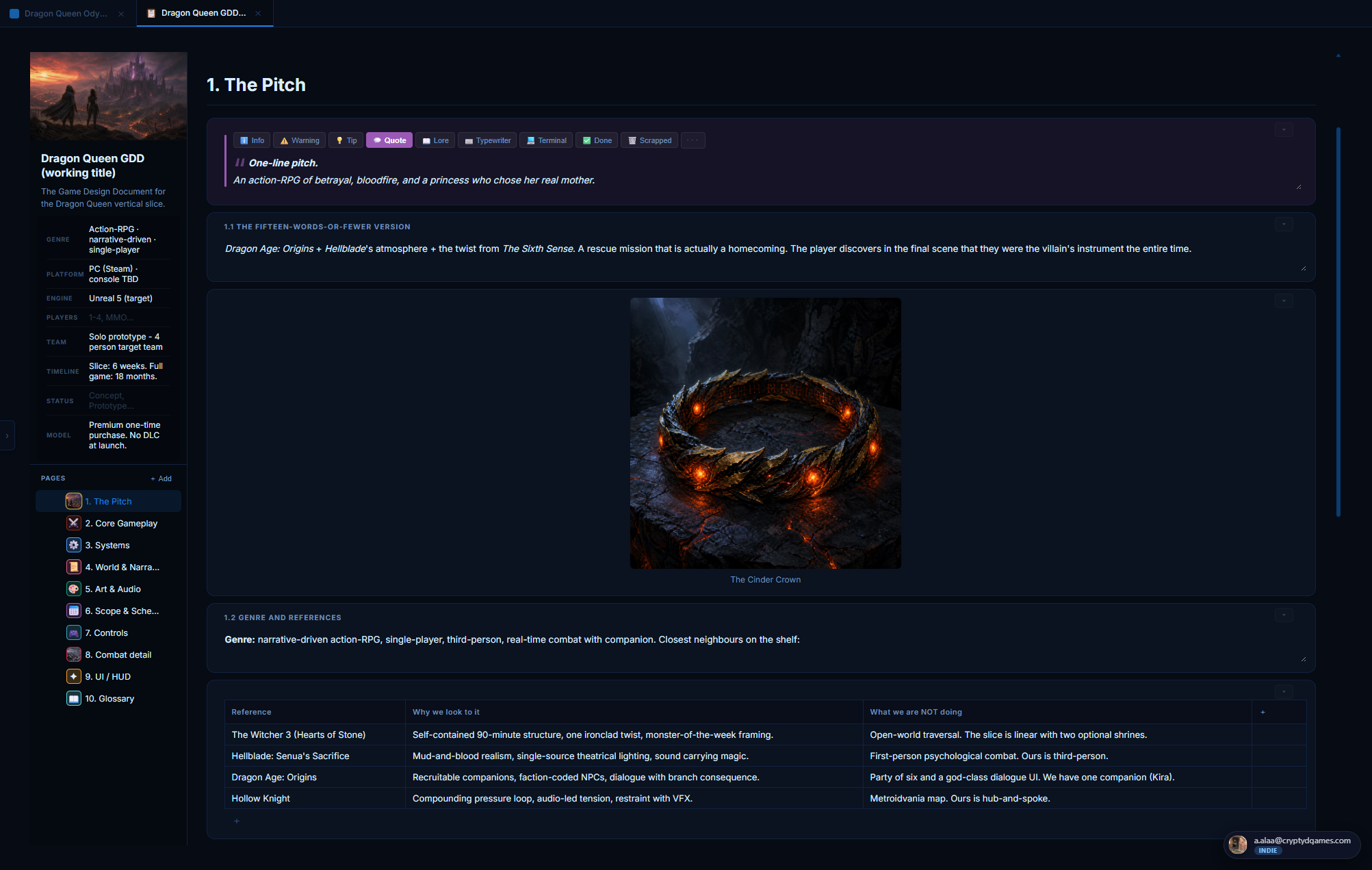
Where you find it
+ Add Content → Game Templates → 📋 GDD / Bible. The same structure serves a Game Design Document, an art bible, a sound bible, or a production plan equally well, so use it for any long-form design doc.
The GDD layout
Three columns: the pages nav on the left, the active page in the centre, and contextual UI on the right (sound mini-player, comments rail, etc.). Pages are drag-reorderable in the nav. Each page has its own cover image, title, and a stack of blocks.
Page covers
Above each page's title, you can add a wide cover image. Cover supports upload + library pick. Once set, drag the cover image vertically to reposition the visible crop (use this for portrait-orientation artwork). The cover thumbnail shows in the pages nav so you can identify pages by image at a glance.
The 12 block types
Inside a page, click + Add Block to insert any of:
Text block
Rich-text editor with heading dropdown (H1/H2/H3), alignment (left/center/right/justify), RTL toggle, font-family dropdown (9 fonts including serifs + monospace), checklist, horizontal rule, indent/outdent, image attach via 📎. Supports @-mentions to any project item.
Callout block
Tinted box with an icon + title + body. Use for "Note", "Warning", "Tip", "Out of scope". Five color presets.
Image block
Drag-drop an image or use 📁 From library to pick from existing assets. Size bar: Fit / ¼ / ½ / ¾ / Full / Original. Editable caption below. Click the image to enlarge in the viewer.
Gallery block
Multiple images in a horizontal scrolling strip. Drag-handles per tile let you reorder. Click any tile to enlarge. Upload or library pick.
Table block
Standard spreadsheet table with addable / removable rows and columns. Inline cell editing. First row is the header (bold). Useful for design pillars, stat comparisons, content checklists.
Object reference block
The most powerful block. Pick one or many items from your project (any type: characters, environments, items, mechanics, quests, levels, GDDs, conversations, notes, images, links, documents, videos). Each picked item renders as a full rich card. Cards are reorderable. Click a card to open the referenced item. Use for: cast lists, location galleries, weapon catalogs, milestones with linked deliverables.
Input scheme block
A clickable controller overlay (PS5 or Xbox, switchable). Click any button on the controller to assign an action label. Use this on the Controls page to document your input bindings visually.
Color palette block
Swatch grid. Add color stops with hex codes. Each swatch has an editable name. Use it on art bibles or UI design pages.
Progress block
Progress bar with a percent (0-100), a label, and a color. Use for tracking production milestones, content-complete percentages, sprint progress.
Timeline block
Vertical milestone list with dates + titles + statuses (planned / in progress / complete / blocked). Each milestone renders as a card with the color tinted by status. Use for production roadmaps.
Sound list block
Embedded audio player + track list. Add tracks via YouTube URL or direct mp3/ogg. Each track has a label, an artist, and a thumbnail. The list works as a real player: play/pause, prev/next, scrubber, volume, loop, shuffle. Floats as a mini-player in the corner when you scroll past the block. Use on sound bibles and music pages.
Divider block
Horizontal rule. Section break.
Block drag-and-drop reorder
Each block has a ⠿ drag handle on the left. Grab it to reorder. You can keep scrolling the page with your mouse wheel while you drag, so a block can travel from one end of a long GDD to the other. Ctrl+Z undoes the last reorder (up to 50 reorders per session).
Tabs and full-screen mode
Click ↗ Open as tab on a GDD to detach it into the tabs bar. The GDD then takes the full main-content area for distraction-free editing. You can open many GDDs as tabs and switch between them like browser tabs.
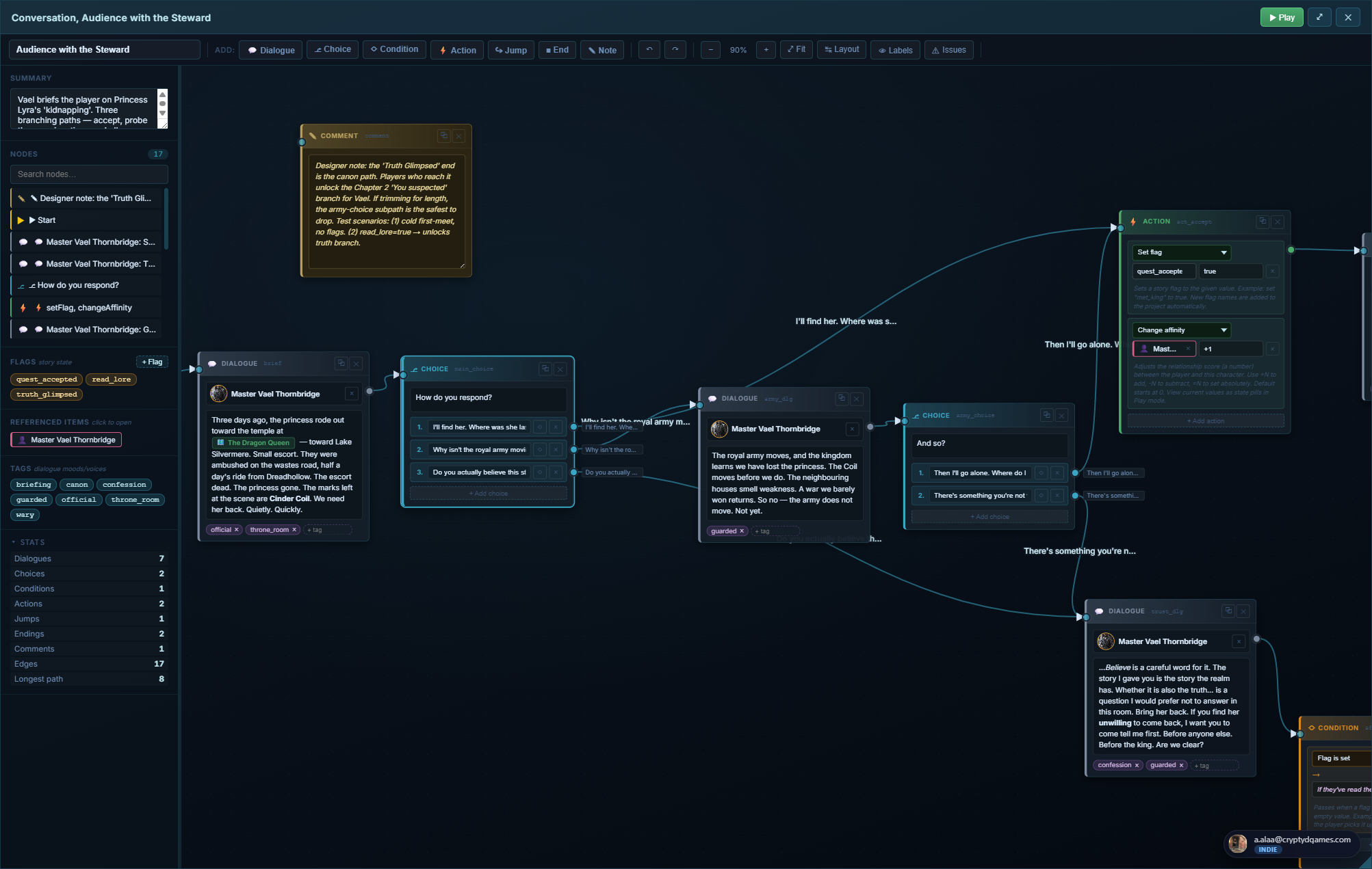
💬 Conversation #
A branching dialogue tree editor. Nodes for lines, choices, branches, jumps, sets, flags. Connections between nodes form the conversation graph. Each line has a speaker (linked character), each choice has a label + a destination, the whole tree is playable end-to-end inside Ludessy without leaving the editor.
Where you find it
+ Add Content → Game Templates → 💬 Conversation.
The conversation editor
Full-screen node graph. Pan with right-click drag or middle-click drag. Zoom with the mouse wheel. The conversation starts from the Start node (auto-created); branches and ends emerge as you connect nodes.
Node types
- Line node: a single spoken line. Picks a speaker (character ref) + writes the line text. Optional inline tag chip (mood / direction).
- Choice node: forks into 2 to 5 player choices. Each choice has a label + an outgoing edge.
- Set flag node: writes a state variable. Use for quest progression markers.
- Check flag node: branches based on a previously-set flag value. The classic "if you helped the priest in Act 1, branch A else branch B".
- Jump node: jumps the conversation to a node label (forward, backward, or to another conversation).
- End node: terminates this branch. Optional outcome label ("Player parts on good terms", "Combat triggered").
- Comment / Sticky note: design notes that don't affect the conversation; for the writer's reference.
Connections
Drag from the gold dot on the right edge of one node to the dot on the left edge of another. The line auto-routes. Multiple connections from a single dot are fine (e.g. a choice node fans out to 4 branches). Right-click a connection for label / type / color options. Alt+click a connection to delete it.
Bundle operations
Ctrl+drag from a dot lifts ALL connections at that dot. Drop on another dot to re-attach the whole bundle, or drop on empty space to delete them all. One undo step covers the whole bundle. Useful for refactoring without re-creating edges by hand.
Speakers
Each line node's speaker is a character ref (picker filtered to character items). Once linked, the line shows the character's portrait + name inline. If you replace the character later, every line that referenced them updates automatically.
Tags and autocomplete
Project-wide chip palette for dialogue tags ("whispered", "angry", "internal monologue"). Once you've used a tag in one conversation, it autocompletes in every other conversation in the same project.
Playable preview
Click ▶ Play in the toolbar to enter playback mode. The editor turns into a transcript-style preview: each line plays in order; choices appear as buttons. Walk through your conversation as the player would. Pause at any node, jump back, replay from a specific branch.
📝 Note #
The most flexible content type. A rich-text page with images, headings, lists, links, fonts, alignment, RTL support, indent / outdent, checklists. Use it for anything that doesn't fit a structured template: lore writing, brainstorms, meeting notes, character profiles you haven't promoted to a Character yet.
Where you find it
+ Add Content → Note (top of the modal, in the basic types row).
The note editor
Toolbar
- H ▾ heading dropdown (H1 / H2 / H3 / paragraph)
- B I U S bold / italic / underline / strikethrough
- ≡ ▾ alignment dropdown (left / center / right / justify)
- ⤺ ⤻ RTL toggle (good for right-to-left text)
- A font-family dropdown (9 fonts including monospace)
- • 1. ☐ bullet / numbered / checklist
- ― horizontal rule
- ← → indent / outdent
- 📎 Image upload an image inline (pastes also work)
- 🔗 link
- ↶ ↷ undo / redo
Inline image controls
Click any inline image to open a popover with:
- Size: S / M / L / Full
- Alignment: left / center / right
- Caption toggle: wraps the image in a <figure> with an editable caption
Drag the bottom-right corner of an inline image to manually resize. Sizes persist.
Paste handling
Paste an image from your clipboard (screenshot, copied web image) and Ludessy uploads it inline, showing a spinner placeholder until the upload settles. You can keep typing while the upload runs in the background.
Tab indent
Tab indents the current paragraph. Shift+Tab outdents. Inside a list item, Tab nests the bullet instead.
@-mentions
Type @ and the picker opens. Select any item in the project to insert a clickable chip. Chips stay clickable forever (open the linked item's sheet) and re-paint automatically if the linked item's title or icon changes.
Thumbnail picker
Notes with images get a thumbnail on the project hub card. By default it's the first inline image; click the "Make thumbnail" toggle on any inline image to promote that one specifically. Or set a "no thumb" flag to fall back to the note icon.
Resizable editor panel
Drag the bottom-right corner of the note editor to resize the whole window.
Size persists per browser in localStorage.
Auto-save
Notes auto-save on every change with an 800ms debounce. There's no Save button because there's no need.
Comments rail
On Team-tier projects, the right side of the note (and every item) has a collapsible Comments rail. Comments are threaded, mention-able, and stored per-item.
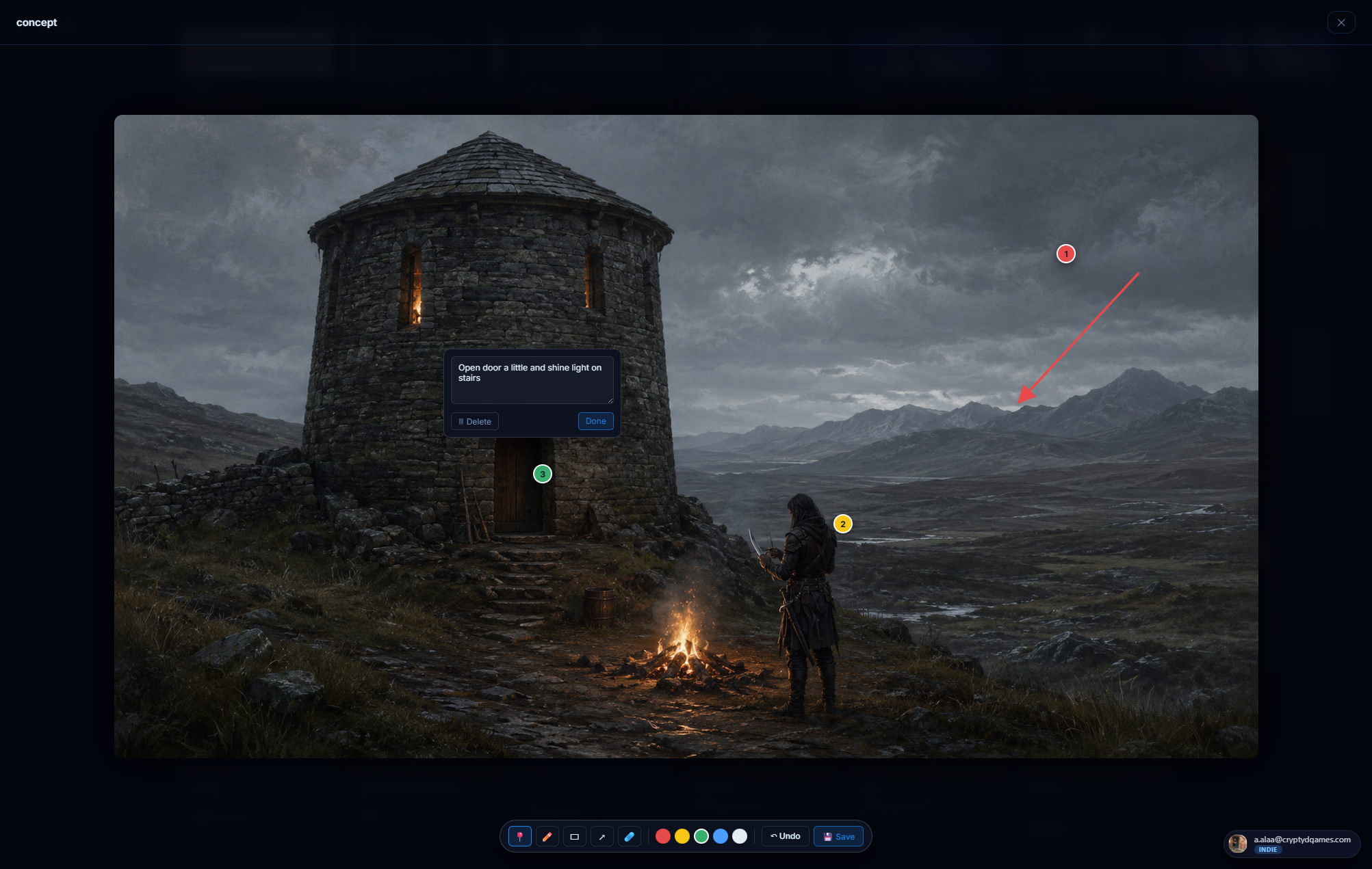
🌄 Image #
A standalone reference image: concept art, screenshots, mood-board plates, UI mockups. Distinct from inline images embedded in notes, gallery blocks, or character visual notes; image items appear as cards in the project hub and can be referenced by other items.
Where you find it
+ Add Content → Image. New: in addition to file upload, the image creation form now has a 📁 Pick from library option to reuse an asset you've already uploaded.
What you can do with an image
Annotator
Click any image item to open the viewer. The viewer has an annotator overlay for art-director review:
- Pin tool drops a numbered circle on any point. Add a note.
- Pen tool draws freehand strokes.
- Rect tool draws axis-aligned boxes.
- Arrow tool draws straight arrows.
- Eraser removes any annotation.
- Color picker: 5 review colors (red, orange, gold, teal, purple).
Annotations are stored as percentage coordinates so they stay positioned even if the image is resized. They render as a small SVG overlay on the project hub card thumbnail too, so annotated images are recognizable at a glance.
Renaming
The display name of an image asset is independent of the underlying filename. Right-click the image card -> Rename. Or rename from the Asset library. Filenames stay UUIDs forever (so references never break); only the display name changes.
Replace in place
Open the image asset in the Asset library and click Replace to upload a new file under the same URL. Every reference to this image (in notes, on character portraits, on environment covers, etc.) updates automatically. Pages auto-cache-bust so you do not need to hard-refresh. Useful when iterating on art: regenerate, replace, and the whole project updates with the new version.
🔗 Link / Document / Video #
Three lightweight types for everything that's not original content but you want to keep alongside your project: external URLs, uploaded files, embedded media.
🔗 Link
A reference to any external URL: a competitor's game page, a Wikipedia article, an inspiration video, your team's Notion. Add a title (optional, defaults to the hostname) + the URL. The card on the project hub shows the favicon + the hostname. Click the card to open the URL in a new tab.
📄 Document
Upload a file: PDF, .docx, .txt, .md, .rtf, etc. The card on the hub shows the file icon + title + size. Click the card to open the document inline:
- PDFs open inline using your browser's built-in PDF reader.
- Text / markdown previews inline as preformatted text.
- Office docs and unknown types show a download card with "Open in new tab" + "Download" buttons.
🎬 Video
Embed a video. Paste a YouTube URL, Vimeo URL, or a direct video file URL (mp4 / webm). YouTube and Vimeo use their official embed players (with title + thumbnail auto-pulled via oEmbed). Direct files render in an HTML5 <video> tag.
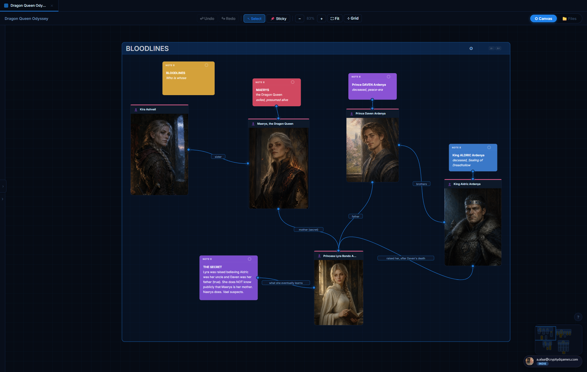
🎨 Project canvas #
A free-form board for sketching the shape of your project. Drop sticky notes, drag in items from the project, connect them with labeled lines. Great for family trees, mood boards, story-beat timelines, system diagrams, anything that wants to be visual.
Where to find it
Click the 🎨 Canvas tab in the left nav after opening a project.
Adding things to the canvas
- Double-click empty space to drop a sticky note.
- Right-click empty space for an add menu (11 node types + sticky).
- Drag an item from the right-side panel (which lists every item in the project, grouped by type) onto the canvas to create a node referencing that item.
- Drag from a connection dot to empty space opens the same add menu at the drop point, and the new node auto-connects to the source dot.
Connections
Every node has small connection dots on all four edges (top / bottom / left / right). Hover a node to see them. Drag from one dot to another node's dot to create a connection. Connections have:
- A type: plain line, arrow (one-way), arrow-bi (both ways), dashed.
- A color (palette of 8).
- An inline editable label (click the line to type).
- Waypoints (drag the line to reroute around other nodes).
Bundle operations on connection dots
Drag from a connected dot = NEW connection. Ctrl+drag from a connected dot = LIFT the whole bundle (all connections at that dot). Drop on another dot to re-attach the bundle. Drop on empty space to delete all. One undo step covers the bundle.
Alt+click any connection line or its label to delete just that connection.
Sticky notes
Six color presets. Rich-text content (paste from a Word doc and the formatting survives, within a sanitized HTML whitelist: B / I / U / EM / STRONG / BR / P / UL / OL / LI / A). Resizable. Draggable.
Pan, zoom, fit, minimap
Scroll-wheel zooms. Right-click drag or middle-click drag pans. Trackpad 3-finger tap registers as middle-click for pan. ⛶ Fit frames every node on the canvas. Minimap in the corner shows the whole canvas with a viewport rectangle.
Alignment guides
While dragging a node, gold lines appear when you align with another node's edges or center. Releases snap. Use to keep the canvas tidy.
Selection
Click to select a node. Ctrl+click to multi-select. Box-select with a drag from empty space. Delete with Del.
Saving
Canvas state (nodes, connections, camera position, zoom) auto-saves on every change. Open the canvas later and it's exactly as you left it.
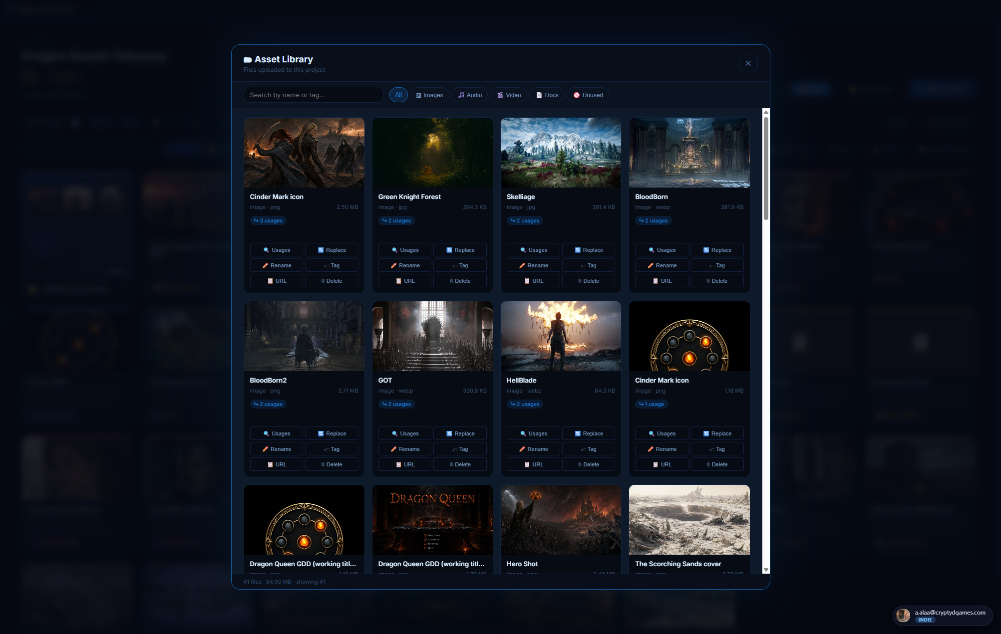
📁 Asset library #
Per-project gallery of every uploaded file. Filter by kind, search by name, tag, rename, delete, see usages, and replace files in place. The asset library is the source of truth for what's in your project's R2 bucket allocation.
Where to find it
Inside any project, click the 📁 Asset Library button in the top bar.
The library view
Grid of every file referenced by any item in this project. Each tile shows:
- Thumbnail (cropped to fit) for images, type icon for docs / audio / video
- Display name (renameable)
- File size + last modified
- Number of usages (which items reference this file)
- Tag chips
Per-tile actions
- Rename: changes the display name (the underlying URL stays UUID-based so references never break).
- Add tags: free-text chips for categorization.
- See usages: which items in the project reference this file. Click to jump.
- Replace: upload a new file in place. The URL stays the same; every reference auto-updates. DOM-wide cache-bust runs so you don't need to hard-refresh.
- Delete: confirmation dialog. Cleans up the file from R2 + the asset_meta row.
Replace-in-place: the killer flow
When you regenerate a character portrait (different angle, older look, etc.) you don't have to re-upload to every place that uses it. Open the Asset library, find the old version, click Replace, upload the new file. Every character sheet / level pin / @-mention / GDD page that referenced the old URL now shows the new one. No hard-refresh needed.
Quotas and tiers
Storage caps are charged to the project owner (not the uploader). Free: 1 GB · Indie: 10 GB · Team: 50 GB · Studio: unlimited. See the Tiers section.
🎵 Sound engine #
Audio that survives navigation. Add tracks to a sound list block on any GDD page; a single shared player at the app level keeps playing as you switch between GDDs, projects, notes. A floating mini-player appears whenever the source block is scrolled off-screen so you never lose control of what's playing.
Where it lives
Inside any GDD, add a Sound list block. The player UI is part of the block.
What works
- YouTube URLs: paste a YouTube link, the title + artist + thumbnail auto-load via oEmbed.
- Direct audio URLs: mp3, ogg, wav, m4a, aac, flac, opus. Filename heuristics parse "Artist - Title" if present.
- Manual entries: title + artist + URL, fill anything in.
Controls
Play / pause, prev / next, scrubber, current-time / total-time, volume, loop, shuffle, "go to source block" (jumps you back to the GDD where the track lives).
The mini-player
Bottom-right floating panel. Appears when the source sound list block scrolls off-screen. Disappears when the block scrolls back into view. Position is draggable + saved in localStorage.
SoundCloud
Documented as a stretch goal. Not implemented in v1. YouTube + direct URLs cover most cases.
🖍 Image annotator #
Art-director review tool baked into the image viewer. Open any image (from a gallery, an inline note image, or an image item) and the annotator overlay is right there: pin / pen / arrow / rect / eraser, five review colors, real-time drawing without lag.
Tools
- 📍 Pin: numbered circle marker. Click to drop, then type a note.
- ✏️ Pen: freehand strokes. Real-time draw (mousedown creates a live SVG element, mousemove updates geometry directly).
- ⬜ Rect: axis-aligned box. Drag from corner to corner.
- ↗ Arrow: straight arrow from drag-start to drag-end.
- 🧽 Eraser: click any annotation to remove it.
- Color picker: 5 review colors (red / orange / gold / teal / purple).
How annotations persist
Annotations are stored as percentage coordinates of the image (not pixel coordinates). So they stay positioned correctly when the image is resized, re-uploaded at different dimensions, or displayed at different sizes (thumbnail, full view, cropped frame).
Card thumbnails reflect annotations
On the project hub, annotated image cards get a small SVG overlay showing the
annotations at thumbnail scale. So you can see at a glance which images are under
review. Annotated thumbs switch to object-fit: contain so the overlay
lines up with the visible image rather than being cropped under it.
Saving
Auto-saved. Close the viewer without "save" needing to be clicked. There IS a prompt if you try to close with unsaved in-flight strokes; click "Discard" or "Keep editing".
⤧ Image cropper #
A LinkedIn-style direct-manipulation crop tool that's built into character / env portraits and item / mech / quest icon heroes. No separate "crop" page; the image itself IS the cropper. Drag to pan, scroll to zoom.
The two gestures
- Drag the image to pan around. Same gesture as Instagram's profile-photo cropper.
- Scroll-wheel over the image to zoom (1.0× to 3.0×).
Tools row (below the image)
- Zoom readout shows the current zoom level (e.g. "1.45×").
- ↺ Reset snaps to defaults.
- ⬆ Replace opens the file picker.
- 📁 Library picks from existing assets.
Where the crop state is used
Your crop is saved with the item itself and applied everywhere the image shows up:
- Project hub card thumbnail
- Canvas node preview
- Level pin frame
- Hover preview popover
- @-mention chip avatar
- Object-ref card
Crop once on the sheet, frame stays everywhere.
@ The @-mention system #
@-mentions are how items in your project know about each other through free-form text. Type @ in any rich-text field and pick an item; a clickable chip is inserted that stays linked forever.
Where @-mentions work
- Notes: anywhere in the body
- Character / env sheets: concept, traits, motivation, flaw, background, visual-note text blocks
- Item sheets: description, how-to-obtain, lore
- Mechanic sheets: tagline, description, core loop, input/process/output, balance notes, edge cases, references
- Quest sheets: narrative hook, objectives, steps, rewards, failure conditions
- GDD text blocks
- Comments rail
The picker
Type @ and a small popover opens above the cursor. Lists every item in the project, grouped by type, with portraits / icons for visual ID. Keep typing to filter live. Press Enter or click to select.
The chip
After selection, a colored chip appears at the cursor: type icon + item title.
Color matches the type's brand color (pink for character, sienna for env, etc.).
Click the chip to open the linked item's sheet. The chip is contenteditable=false;
it behaves as a single character in the text flow.
What happens when the linked item changes
- Item renamed → all chips referencing it auto-update their displayed label on next render.
- Item icon changed → chips auto-update.
- Item deleted → chips render as a red "⚠ deleted" broken-ref chip. Click to remove or replace.
📂 Folders #
Drive-style folders inside a project for grouping items. Color-coded, draggable, no nesting. Open a folder to scope the project view to its contents; click the breadcrumb to go back to All Items.
Creating folders
Top of the project view, click + New folder. The folder appears immediately (optimistic), in inline-rename mode. Type the name + press Enter. Pick a color from the per-folder context menu.
Two layout modes
Toggle the layout mode in the project header:
- Strip mode: folders show as a horizontal strip at the top, items below in a single grid.
- Mixed mode: folders interleave INTO the grid as Drive-style "folder cards" alongside items.
Moving items between folders
- Drag a card onto a folder tile: moves it into that folder. Optimistic (instant visual feedback, persists in the background).
- Drag a card onto the "All Items" breadcrumb: removes it from any folder (back to root).
- Right-click a card → Move to folder...: opens a picker.
Inside a folder
Opens a scoped view: only items in that folder show. The filter pills row stays at the top so you can further filter by type. Click 📁 All Items in the breadcrumb to go back to root.
Add Content from inside a folder
When you're scoped to a folder and click + Add Content, the new item lands IN that folder automatically. (Earlier versions dropped it at root and you had to drag it in.)
Folder delete
Right-click any folder → Delete. Confirmation dialog. Items inside the folder are NOT deleted; they move back to root (All Items). Optimistic delete (the folder disappears the moment you confirm; restores with a toast if the server rejects).
🔍 Filter and search #
Two ways to narrow a project view: type-filter pills at the top, and a search box for free-text matching.
Filter pills
Horizontal row at the top of the project view. One pill per content type plus an All pill. Click to filter. Pills are split into two groups by a divider:
- Basic types: Notes / Images / Links / Docs / Videos
- Game templates: Characters / Environments / Mechanics / Levels / GDDs / Items / Quests / Conversations
Search
Top-bar search box. Live filter on the visible item grid. Matches against item titles. As you type, the grid shrinks to matching items only. Clear the box to restore.
Combinations
Filter + search compose. Filter to Characters, then search "Kira" to find all characters whose name contains "Kira". Filter to Environments, search "Marsh" to find the Whispering Marsh env.
Folder + filter
When you're scoped to a folder, the filter pills further narrow the in-folder view. So you can have "show me only the Quests inside the Act-1 folder".
☑️ Multi-select #
Drive-style multi-select on the project hub. Pick several items, do something to all of them at once: move to folder, duplicate, delete, clear.
Entering multi-select
- Ctrl / Cmd + click a card: toggles it into the selection.
- Shift + click a card: range-select between the last clicked card and this one.
- Any click outside a card exits multi-select.
The action bar
When 1+ items are selected, a floating action bar appears top-center of the view:
- Selection count (e.g. "3 items selected").
- 📂 Move to folder: opens a folder picker, all selected items move together.
- 📑 Duplicate: clones each selected item. Each copy gets " (copy)" appended.
- 🗑 Delete: confirmation, then bulk-delete. Optimistic. Failures are restored individually.
- Clear: exits multi-select without doing anything.
✋ Drag and drop #
The whole hub responds to drag. Reorder cards within a row, drop into folders, drop on the All Items breadcrumb to un-file. Drag is optimistic everywhere.
What you can drag
- Cards: drag any item card to reorder, or drop on a folder / breadcrumb.
- Folders: drag a folder tile to reorder the folder strip.
- GDD blocks: drag the ⠿ handle on any block to reorder. Your mouse wheel keeps working during the drag, so you can scroll the page to reach the spot where you want to drop the block.
- Visual notes: drag the ⠿ handle to reorder text + image blocks on character / env / mech / quest sheets.
- Gallery tiles: drag the handle on each gallery tile to reorder.
- Pages in a GDD: drag in the left nav to reorder.
- Canvas nodes: drag anywhere.
- Level shapes: pick up + move with the Select tool.
- Files from your desktop: drag-drop onto an image-friendly area (note image attach, character portrait, env cover, GDD image block, asset library) to upload.
Drop targets explained
- Card onto card (left half): inserts before. Gold bar appears on the left.
- Card onto card (right half): inserts after. Gold bar on the right.
- Card onto folder tile: moves into the folder.
- Card onto "All Items" breadcrumb (when inside a folder): removes the item from the folder.
👥 Share a project #
Team-tier and Studio-tier accounts can invite collaborators to a project. Each invitee gets a role (Viewer / Editor) and shows up in the project's member list. The project's storage cap is charged to the owner, not the collaborators.
Inviting
Open the project. Click the 👥 Members button in the project header. Type the invitee's email. Pick a role. Send. They receive an invite email with a "Join project" link.
Roles
- Owner: the project creator. Can do everything: invite, remove members, transfer ownership, delete the project.
- Editor: full read + write on items, canvas, level. Cannot manage members or delete the project.
- Viewer: read-only. Can browse, leave comments, but cannot edit items.
Concurrent editing safety
Ludessy notices when two people are editing the same item at the same time. If a teammate saves a change while you have an older version open, your save is blocked and you see "Another collaborator saved this item" with a Reload button. Nobody's work ever silently overwrites someone else's.
Per-seat billing (Team tier)
Team tier is priced per seat. Inviting a member to a Team-tier project automatically adds a seat to your subscription. Removing them drops one. The next billing cycle reflects the current member count, no manual sync needed.
💭 Comments #
A sliding comments rail attached to every item sheet on Team-tier projects. Threaded, mention-able, scoped per item. Hidden on lower-tier projects.
Opening the rail
On any item sheet (character / quest / mechanic / etc.), the comments rail lives at the right edge of the sheet, collapsed by default. Click the speech-bubble icon to expand. The unread badge shows how many new comments since you last opened.
Posting
Type in the input at the bottom of the rail. Enter posts. Shift+Enter adds a newline. Comments support basic formatting (bold / italic) and @-mentions of other project members.
Threading
Each comment can be replied to. Click "Reply" on any comment; the next thing you type indents underneath. Resolved threads collapse to a one-line summary.
Notifications
When you @-mention a project member in a comment, they get an in-app notification + an email if their settings allow.
📊 Activity feed #
Per-project log of every meaningful event: items created, deleted, moved between folders, role changes, comments posted, member invites. Coalesces rapid bursts (e.g. "Kira edited the GDD 14 times in 4 minutes" rolls up into a single entry).
Where to find it
Project header → 📊 Activity button. Opens a side panel with the most recent events at the top.
Event types tracked
- item.created / item.updated / item.deleted
- folder.created / folder.deleted
- member.invited / member.role_changed / member.removed
- comment.posted
- project.cloned (when an admin uses Clone to me)
- asset.replaced
Filtering
Type filter dropdown narrows to a specific event class. Time-window dropdown (last 24h / 7d / 30d / all) narrows by recency. Search box matches event labels.
⚡ Idea dump #
A frictionless place to capture half-formed ideas before they become projects. Lives at the top of the left nav. Drop in concept seeds, mechanic ideas, character sketches, references, problems you noticed. Tag them, attach images, promote them to real projects later.
The dump view
Two columns:
- Left: capture bar at the top + ideas grid below. Type and hit Enter to capture an idea, then refine it inline.
- Right: stats + filter pills (by type, status, tag).
Idea types
- ⚡ Concept: a game idea
- ⚙️ Mechanic: a system idea
- 👤 Character: a person idea
- 🌍 World: a place / setting idea
- 🎨 Vibe: a tone / aesthetic / mood
- 🔗 Reference: a game / video / article to revisit
- ❓ Problem: a question or pain point to solve later
Promoting an idea to a project / item
Each idea card has a "Send to Project" or "Promote to Project" action. The promotion is type-aware:
- Character ideas → become a Character item with the idea's title + portrait.
- Mechanic ideas → become a Mechanic item.
- Quest ideas → become a Quest item.
- Concept ideas → become a new Project.
- Image-only ideas → become Image items.
- Others → become Notes inside an existing project (with the idea image embedded).
Why a separate dump and not just a project?
Because game ideas come at random hours. The dump removes friction: no project needed, no folder structure, no naming. The cost of capture is one keystroke and a sentence. Refinement and promotion come later.
⚙️ Account and profile #
Manage your sign-in, profile, password, connected sign-in providers (Google, Facebook), two-factor authentication, and account data, all from one place.
The account chip (bottom-right)
Persistent pill in the bottom-right corner. Shows your avatar + email + tier badge. Click to open the popover.
The popover
- Profile header: avatar, name, email, tier badge + tier blurb.
- Manage profile: opens the secure profile editor (matches the app's dark + gold look). Handles avatar upload + crop, password change, email management, two-factor authentication setup, connected sign-in providers (Google / Facebook), and signing out of other devices.
- Legal: Terms of Service, Privacy Policy, Cookie Policy.
- Download my data: privacy-compliant export. Downloads a file containing every project, every item, and references to all your uploaded files, plus your account info.
- Sign out: ends the session.
- Delete account: permanent. Confirmation flow. Data is purged.
Avatars
Either upload a custom photo (via the Manage profile UI) or use the default: a deterministic gradient + your initial. The gradient is seeded by your user id, so the same email always gets the same colors.
Session expiry
If your sign-in token expires while the app is open, a modal appears: "Session expired - sign back in". Click the button to re-open the sign-in card (themed to match the app). Your draft state is preserved.
💎 Tiers and limits #
Four tiers. The first (Free) is free forever. The other three (Indie, Team, Studio) carry a 14-day trial. All trial features are unlocked during the trial, no credit card needed up front.
| Limit | Free | Indie | Team | Studio |
|---|---|---|---|---|
| Projects | 1 | Unlimited | Unlimited | Unlimited |
| Items per project | Unlimited | Unlimited | Unlimited | Unlimited |
| Storage | 1 GB | 10 GB | 50 GB | 200 GB |
| Collaborators | Solo only | Solo only | Unlimited | Unlimited |
| Comments + activity feed | - | - | ✓ | ✓ |
| Audit log | - | - | - | ✓ |
| Priority support | Best-effort email | Priority email | ||
| Single sign-on | - | - | - | ✓ |
Upgrading
Bottom-left of the project view shows a "Upgrade" button when you're on Free / Indie. Click to open the upgrade modal: tier comparison, per-tier features, Continue → Lemon Squeezy hosted checkout.
Downgrading
Cancel your subscription from the Customer Portal (popover → Manage subscription) and your tier drops back to Free at the end of the current billing cycle. No data is deleted; items just become read-only if you're over the new tier's caps.
💳 Billing and trial #
Billing is handled by Lemon Squeezy. They take care of taxes, currencies, and local payment methods worldwide so you don't have to. Subscriptions, plan changes, payment methods, invoices, and cancellations all live in the Lemon Squeezy Customer Portal.
Starting a trial
Click any tier's "Start trial" button. You're sent to the secure Lemon Squeezy checkout page. After checkout your account is bumped to that trial tier for 14 days. No charge yet; the charge happens at day 14 unless you cancel.
The trial banner
While you're on a trial, a banner at the top of the app shows "Trial ends in N days". Amber when under 3 days remaining. Click × to dismiss for 24h (returns on next page load after that).
Trial expiry
At day 14, if you didn't cancel, you're charged for the first billing period and your tier persists. If you DID cancel, your tier drops back to Free at expiry + the trial banner clears.
The Customer Portal
Account chip popover → Manage subscription. Opens the Lemon Squeezy portal in a new tab. From there you can:
- Update payment method
- View past invoices + receipts
- Change plan
- Cancel
- Update your billing email
Per-seat sync (Team tier)
Team tier sells per seat. Inviting a member to a Team-tier project automatically increments the LS subscription quantity. Removing a member decrements it. The next billing cycle reflects the current member count.
⌨️ Keyboard shortcuts #
All keyboard shortcuts in one table. The most useful ones first.
| Shortcut | Where | What it does |
|---|---|---|
| Ctrl+Z | GDD page | Undo the last block reorder |
| @ | Any text field | Insert a chip referencing another item |
| Tab | Note editor | Indent current paragraph |
| Shift+Tab | Note editor | Outdent current paragraph |
| Esc | Any modal | Close the modal |
| Right-click + drag | Canvas | Pan around the canvas |
| Middle-click + drag | Canvas | Pan around the canvas |
| Alt + click | Canvas connection | Delete that connection |
| Ctrl + drag a connect dot | Canvas | Lift the whole bundle of connections at that dot |
| Ctrl / Cmd + click a card | Project hub | Toggle the card into multi-select |
| Shift + click a card | Project hub | Range-select between the last clicked card and this one |
| Mouse wheel | GDD block drag | Scroll the page while dragging a block |
❓ Frequently asked questions #
Where is my data stored?
Your text content lives in a secure managed database; your uploaded files (images, documents, video) live in encrypted cloud storage. Both data centers are in the United States, both are encrypted at rest, and you can export everything at any time from the account chip popover.
Can I export my whole project?
Yes. Project header → ⋯ menu → Export. Downloads a single file containing every item, folder, canvas, level layout, and the links to your uploaded assets. The same file can be imported back into any Ludessy account.
Can I delete my account?
Yes. Account chip popover → Delete account. Confirmation flow. All your projects, items, comments, uploaded files, and account metadata are purged.
Is there a desktop app?
Not in v1. Ludessy is web-only. It works in any modern browser (Chrome, Edge, Opera, Firefox, Safari).
Does Ludessy work offline?
Not yet. Everything is server-stored, so you need a network connection. An offline-friendly mode is on the roadmap, not in this release.
Can I host Ludessy myself?
Not currently. The Studio tier covers single-tenant deployment for organizations that need it; reach out for a quote.
Where do I report bugs or request features?
Two good options: drop a note in the Discord (fastest, you'll often hear back same-day), or email support@ludessy.com. A screenshot or a short screen recording always helps us reproduce what you saw.
Is there a Discord?
Yes. Join the Ludessy Discord →. Ask questions, share what you're building, and follow new feature releases.